A bad contact page will frustrate your website visitors. That’s a missed opportunity, because a good experience will lead to goodwill instead.
Tip 1: Name your contact page ‘Contact’ or ‘Contact Us’
Research shows that people who want to get in touch with you will look for a button titled ‘Contact’ or ‘Contact Us’. Use this title for the page containing your contact information. Don’t use any different words or you will confuse your visitors.
Tip 2: Place ‘Contact’ at the right end of the main menu
Over the years, the contact page has earned a standard location on websites. It’s most easily found in the main menu. If your website uses a top navigation bar, that’s a good place for it as well. In either case, make sure the button is located at the right end of the menu.
Some visitors are more likely to scroll down when they are looking for your contact details. You can satisfy these people by putting a link in the footer of your website as well.
“When visitors want to reach the organization, they look for links with the text contact”
Tip 3: Add your email address
You can use a ‘mailto’ link to offer a clickable email address. This will take your visitor straight to their email client. It will open a blank message with the address already filled in. If your organization has multiple departments, mention every email address relevant to your visitors.
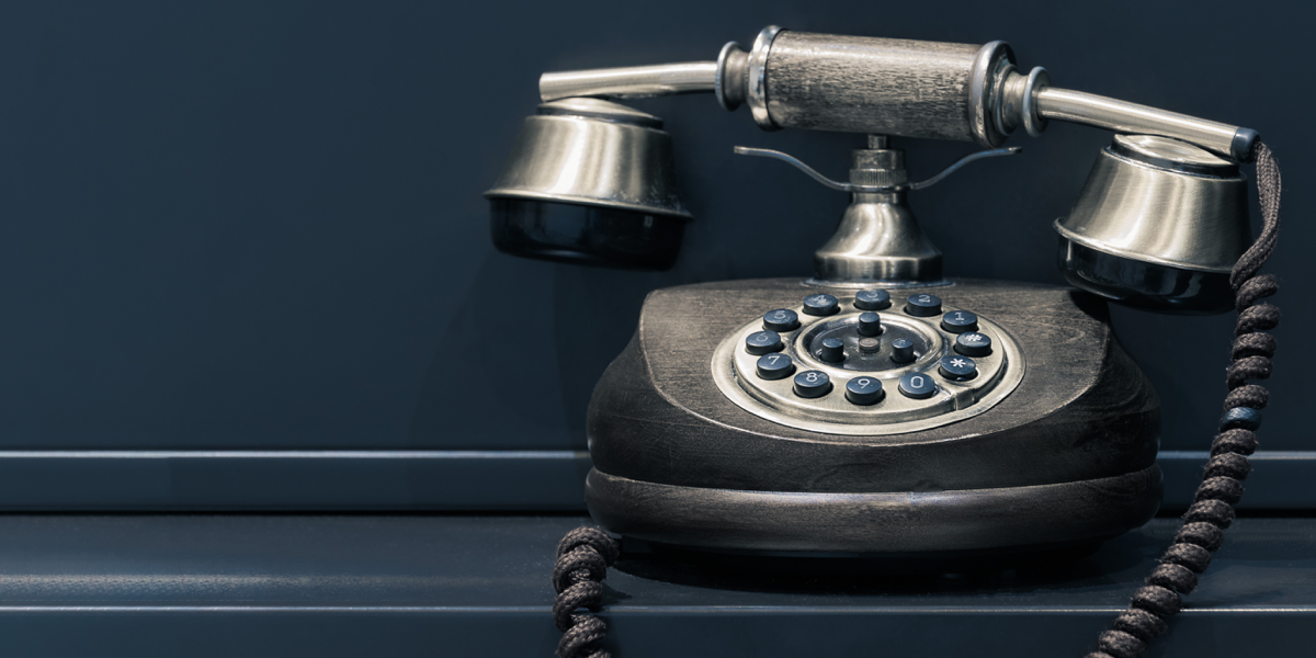
Tip 4: Include a clickable phone number
Make sure your customers can reach you by phone. Site visitors using a smartphone can call you directly if you offer a clickable phone number. Mention the purpose of the phone number (if you have several). To avoid any disappointment, mention the hours during which you can be reached.
Tip 5: State your address clearly
Mention your address on your contact page. Is your mailing address different to your physical address? Make a clear distinction between the two for clarity.
It’s easy to add a link next to your address that opens Google Maps automatically. All your visitor needs to do is put in their starting point to get directions to your business.
Tip 6: Add a short contact form.
A good contact form is very short. A long contact form will discourage people from sending a message.
Your contact form should have:
- As few text fields as possible
- A required field for a phone number or email address (to reach the sender)
- Clear labels (Name, Email address, Message)
- A check box consenting to the use of personal information
Remember: visitors who fill in your contact form are entrusting you with their personal data. Include the data you gather in your data privacy statement (which, in the EU, should be in accordance with General Data Protection Regulation). This privacy notice should be available to read on your website.
In need of help or advice?
Are you pressed for time? Could you use some help crafting the perfect contact page? Get in touch with us for help with marketing, web design and communications.
References
- Don’t Make Me Think, Steve Krug (2013)
- Letting Go Of The Words, Janice Redish (2012)
- Customer Journey Special, Marketingfacts (2016)
- User Experience Report, Nielsen Norman Group (2018)